supplements · Teardown
IM8 Health
A brand that monetises the first order brilliantly: stacks, subscription, welcome-kit gifting, and a Rebuy cart cross-sell already live. The room left is a low-ticket bump, a consumable cart cross-sell, and the wide-open post-purchase window.
 Shopify
 Klaviyo
 Rebuy
 Gorgias
IM8 is further along than almost any store we tear down: the hero product is a stack by design, subscription is the default, the welcome kit gifts value on the first order, and the cart already runs a Rebuy cross-sell. So this is the sharper exercise: where do you add second-sale value to a brand that already monetises the first order well? Mapped to Upsellr, page by page, with the wins they've banked called out straight.
Home page

New visitors meet an athlete ritual first (Giannis, "the MVP's most valuable routine," press logos) before the concrete substitution (one stack instead of a cabinet of bottles) is spelled out. A softer top-of-funnel promise thins the pool of buyers every downstream offer multiplies against.
Fix: Keep the athlete pull, but say the swap plainly above the fold. Each point of base conversion won here compounds through the bump, the cart cross-sell, and the post-purchase offer later.
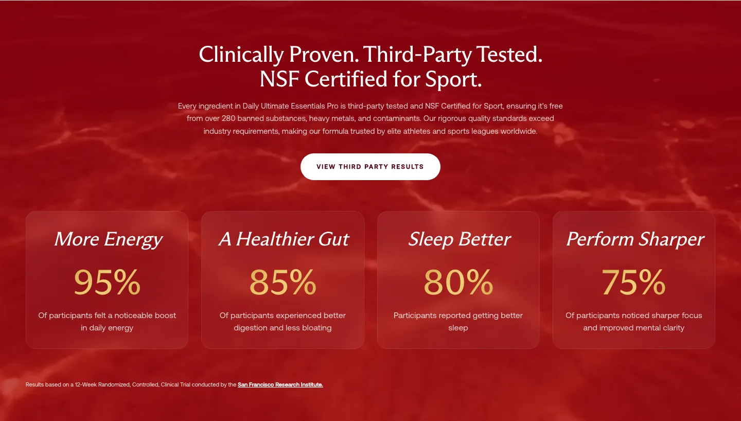
This is where IM8 is elite: NSF certification, third-party testing, a clinical comparison, clinician reviews, 50M+ servings. That credibility is the platform every upsell stands on; a buyer who trusts the brand says yes to a bigger cart.
Fix: Protect the proof layer as-is. The AOV gains sit in placements and the post-purchase window, not in the trust the brand has already earned.
Product page
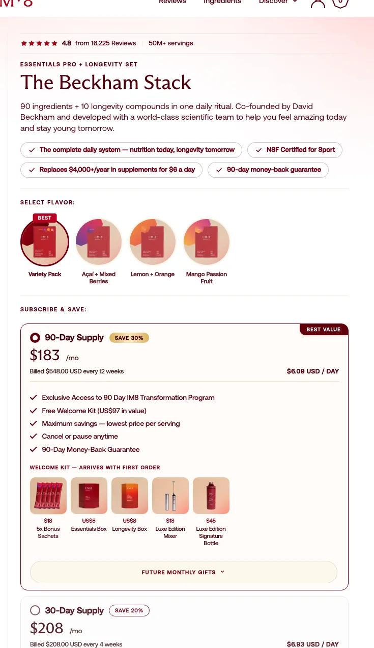
A lot rides in this box before the bump even appears: variant, a four-flavour picker, 90-day vs 30-day, a welcome-kit list. For someone who hasn't committed yet, that's a wall of decisions, and every buyer who stalls there is a buyer who never sees an add-on.
Fix: Default the 90-day plan and dim the rest. The cleaner the core decision, the more attention is left for the impulse bump that should sit right beside it.
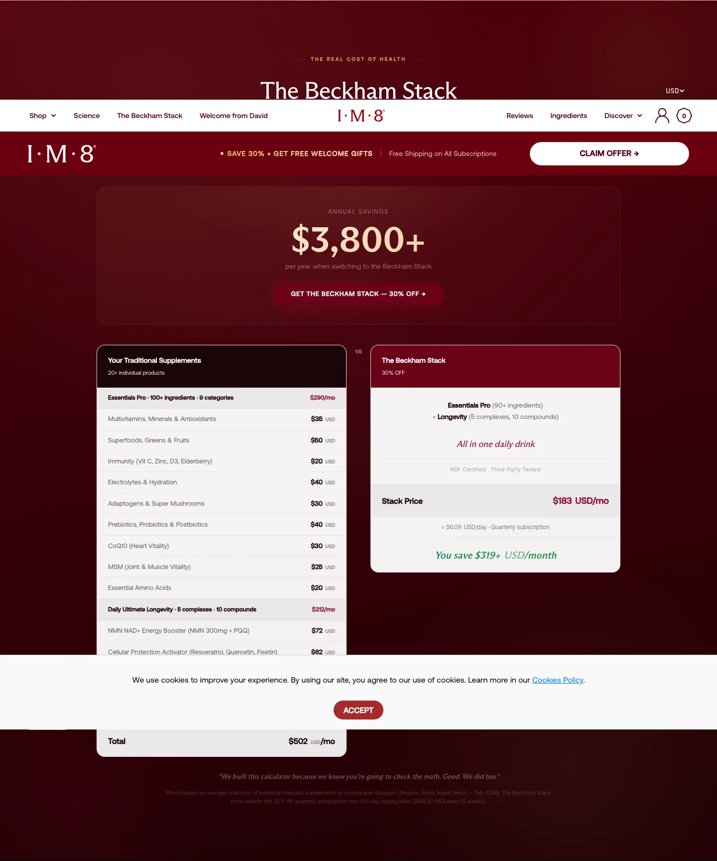
The page runs forever: dual-formula explainer, organ-system map, cost comparison, advisory board, FAQs. Great depth, but on mobile the buy box (and anything attached to it) disappears early, and the strongest value sits far down the scroll.
Fix: This is a Baseline-shaped rebuild: a sticky buy-bar plus a re-sequenced page so the decision and its add-ons stay reachable. Keeping the offer in view is itself an AOV lever on a page this long.
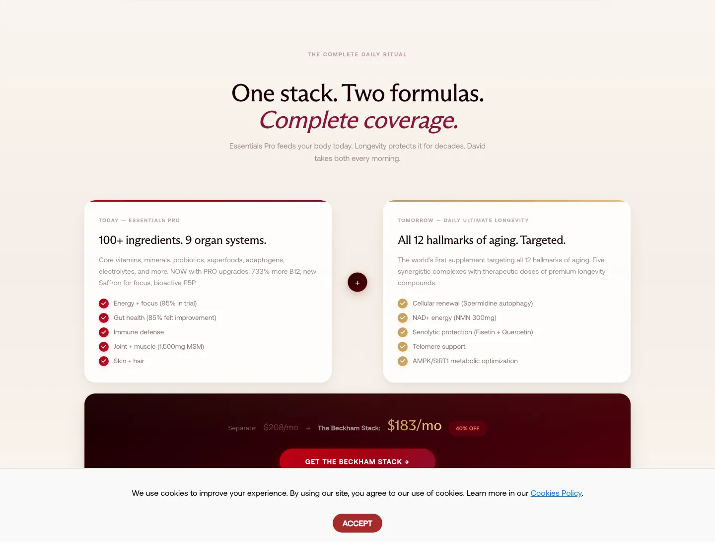
The "one stack, two formulas" story and the "replaces 20+ supplements, $4,000+ a year" math are the most persuasive AOV arguments on the page, and they're parked mid-scroll, away from the moment of decision.
Fix: Surface a condensed value-stack beside the buy box. Anchoring the price against $4,000+ of replaced supplements right at the decision makes the larger plan the obvious pick, a Baseline placement move.
Subscription and welcome-kit gifting are handled, but nothing cheap and impulse-friendly sits next to Add to Cart: no shaker, no travel single, no taster. Every route is a recurring commitment, so the easy add that lifts the very first order isn't on offer.
Fix: Drop an Upsellr bump (Product/Bump, Compact) right at the CTA: a shaker or a travel 7-pack. One obvious, low-ticket, one-click add that rides on top of the stack without muddying it.
Cart drawer
Genuine credit: the drawer already carries a free-shipping reward bar and a Rebuy "Complete your stack" cross-sell. The refinement is the target: it leans toward an accessory (a travel pouch) instead of a consumable that pulls the next reorder forward.
Fix: Hold the reward bar; aim the cross-sell at a refill or a flavour single so the cart upsell feeds replenishment and LTV, not just a one-time accessory sale. Upsellr can drive it off the active stack.
Because the cart is already this strong, the real prize is the untouched moment right after payment, the highest-intent point in the whole journey, currently left empty.
Fix: Add an Upsellr one-click post-purchase offer (a travel pack or a complementary single, no re-entered payment). A 20-40% post-purchase rate is the usual band. Margin-check it against the stack's bundled COGS first.
The drawer adds value but skips reassurance: no 90-day guarantee line, no value recap at the final step, exactly where a high-ticket buyer second-guesses.
Fix: Put a one-line guarantee and a condensed value recap in the drawer so the confidence the page built survives to checkout. The upsell is already there; back it with reassurance so fewer carts stall.
Screens


What we'd fix
- 1Pin a mobile buy-bar so the offer never scrolls away on a page this long: an offer the buyer can't see can't be taken.
- 2Lift a tight value-stack and proof capsule next to the buy box; making the price feel earned at the decision point raises the take rate every upsell builds on.
- 3Default the recommended plan and quiet the alternatives so fewer buyers stall on the choice before they ever reach a bump.
- 1Slot a low-ticket Upsellr bump beside Add to Cart (a shaker or travel single): every current path is a recurring plan with no impulse-friendly add.
- 2Re-point the existing Rebuy cart cross-sell from an accessory to a consumable refill so it lifts reorder value, not just one-off margin.
- 3Install a one-click post-purchase offer on the thank-you page: the cart is handled, but the richest second-sale moment after checkout is still empty.
Want these upsells live without dev?